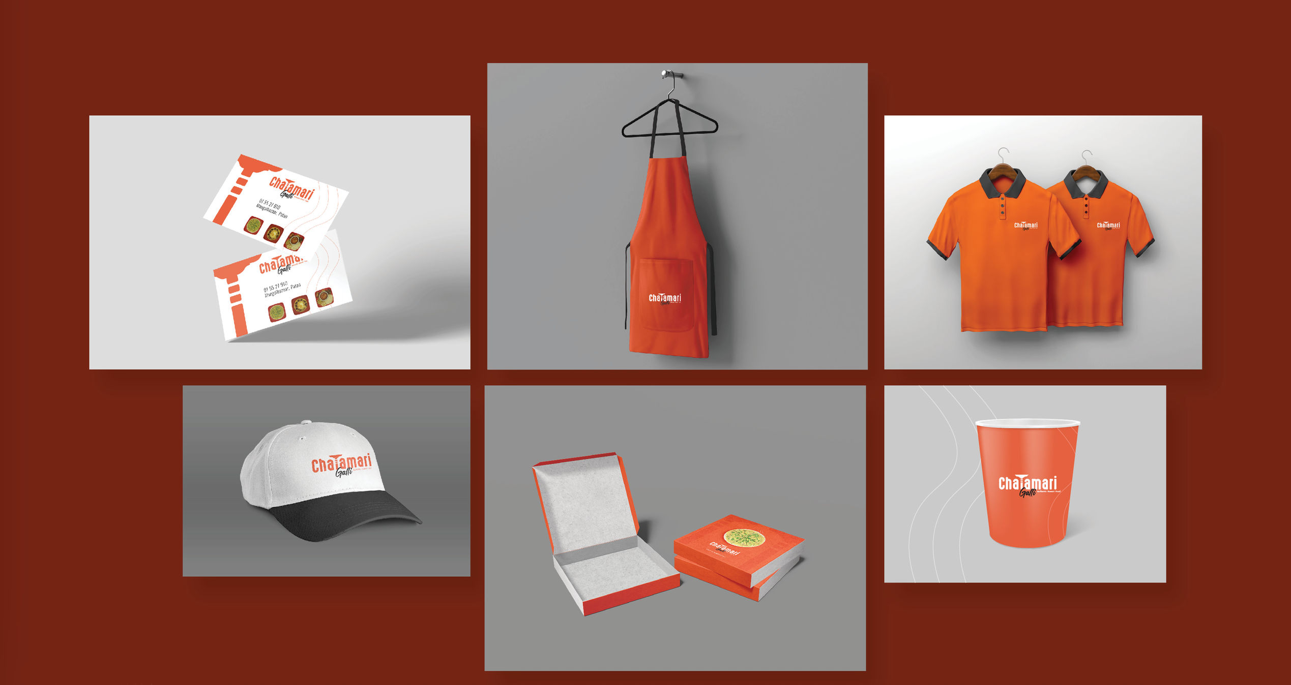
Chaiamari Galli
Visual identity for an authentic Newari food brand
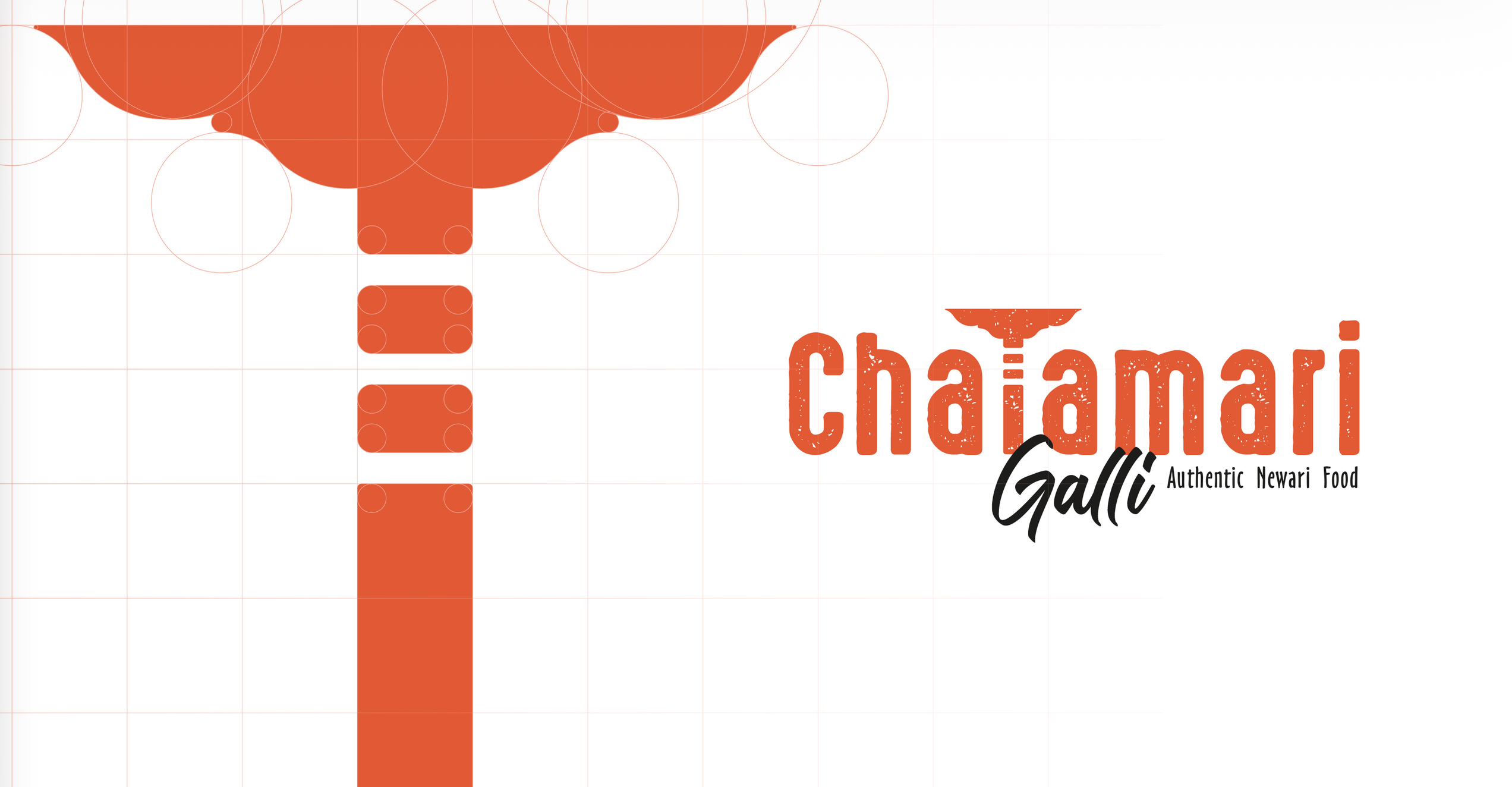
A complete brand identity for a restaurant specializing in authentic Newari food. The mark pairs orange abstract geometry — circles and folded planes — with a black script for the "Galli" line, so modern minimalism and cultural storytelling sit in the same lockup.
The brief
A kitchen in Patan selling one dish needed a mark that could carry the whole brand — readable on a signboard, a stamp and a takeaway box alike.
Construction
The glyph was drawn on a circle-and-square grid so the curves stay even, with a minimum width below which the descriptor drops away and the mark runs alone.
Type and colour
A condensed slab with a printed texture carries the wordmark, a fast script handles the sub-name, and one orange does the work with black held back for type only.
Outcome
One mark at three fixed sizes with a clear-space rule — enough for the kitchen to order signage and packaging without a redraw.