Chatamari Brand Kit
Taking one restaurant mark across every physical thing a customer touches
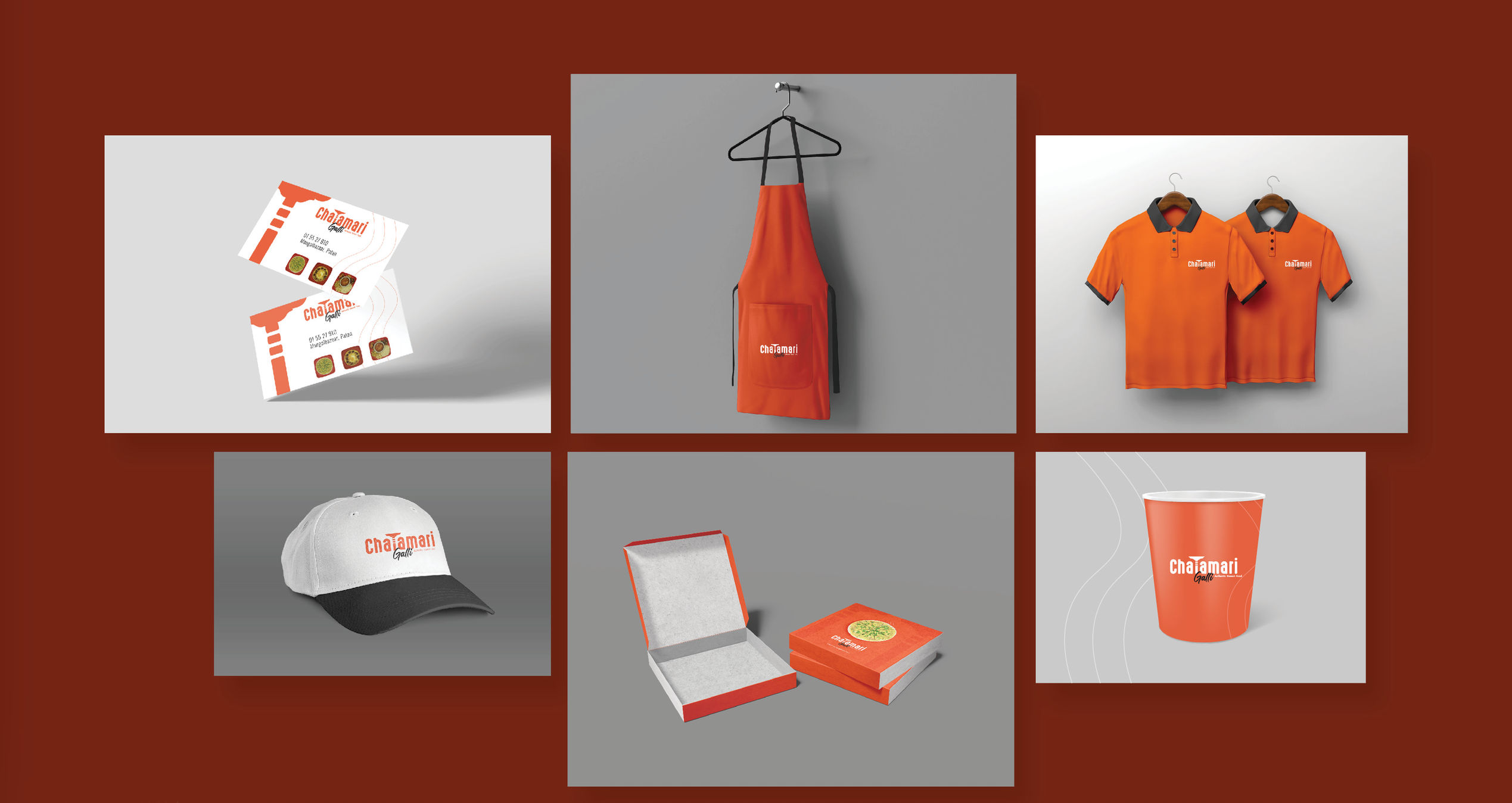
Chatamari sells a single dish, made the way Patan has made it for generations. The identity already existed as a wordmark; what it did not have was a system — a rule for how the mark behaves on an apron, a takeaway box, a ceramic cup, a card handed across the counter. This project built that system and then produced every piece in it.
The brief
Uniforms, packaging and print were being ordered piece by piece from different vendors: three oranges, two logo sizes, no rule for clear space. The ask was to fix the inconsistency and hand over files a print shop could run without asking questions.
Construction
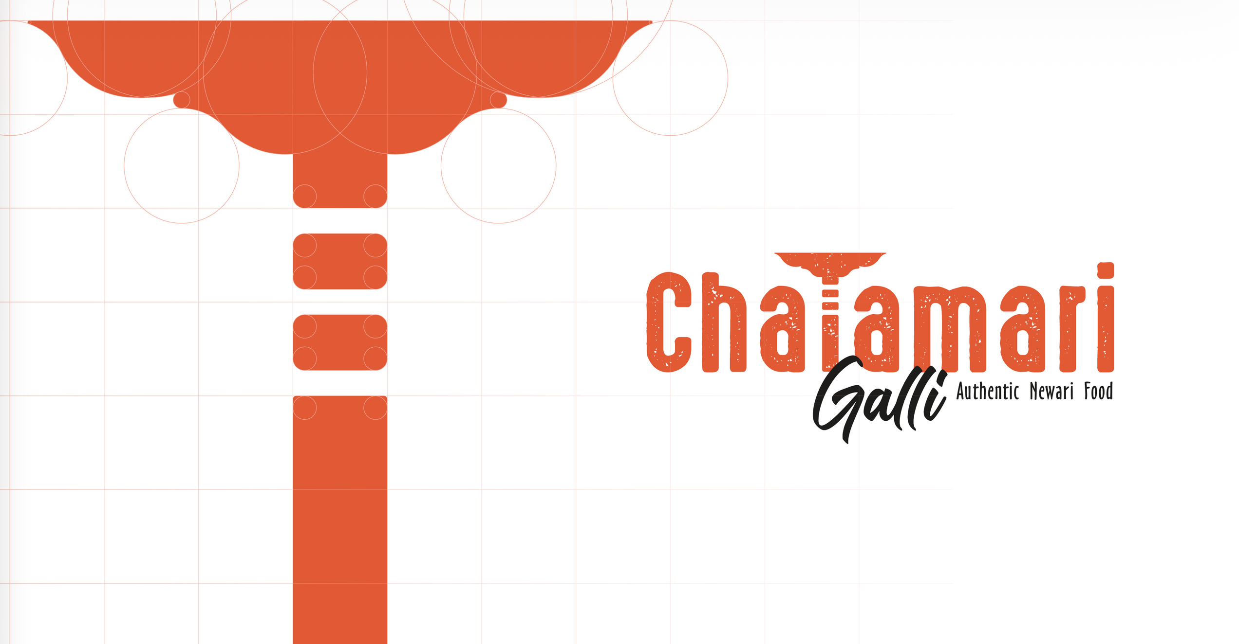
The mark was redrawn on a circle-and-grid construction so the curve of the dish stays even, and a minimum width was set below which the descriptor drops away and the glyph runs alone.
Palette and type
One orange does the work. Black is held back for type only, and an off-white carries the interior of packaging so food photography stays the brightest thing in frame.
Application
Nine pieces were produced from the same set of files: business cards, aprons, polo shirts, caps, two box sizes, cups, a counter card and stickers. Every item places the mark at one of three fixed sizes, so nothing needed a bespoke artboard.
Outcome
The restaurant now reorders from one folder. Print-ready files are locked per item with bleed and colour already set, so a new batch of boxes or a new hire's apron comes back matching what came before.